beautiful Helene on etsy’s The Storque


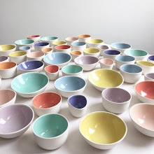
A few months ago, the lovely Helene who writes, styles, and photographs Tartelette, ordered a set of gleena plates. And what lucky plates they ended up to be! All sorts of deliciousness has been created on them by Helene.

Visit Helene and her story for The Storque by clicking here. Many many talented etsy sellers are mentioned.

thank you to Try Handmade for a fantastic article

Thank you to Kim O’Brien, a writer for Try Handmade, for a wonderful write up on gleena. Click here for the full article.

colour inspiration: part 2


These stunning colors are from the etsy shop Pure Natural Minerals.

a coat of paint

This past weekend my dearest friend Agnethe visited my new place. After getting our toes painted, we set to work painting my kitchen. The space is large, was painted off-white a long time ago, and lacked personality. The insides of the cabinets had remnants of paper and a bad, uneven paint job, as if someone lost interest mid-way through the job. I had some paint left over from my studio, and we decided to alternate the orange and the yellow in each cabinet.

The result was modern, and happy, and featured on Apartment Therapy, whoo hoo! Big thank you to Sarah Rainwater for the article.


The next step is a fresh coat of clean white on the outside of the cabinets and the walls. I am also thinking of painting a warm gray in this corner:


As Agnethe says, it will immediately shorten the space, which is long, and warm up the room.

colour inspiration: part 1


Top two images are from an old Conran’s catalogue.

Above image is from etsy seller Jazz Green, whose paintings I love.

still life saturday with etsy seller littlebyrdvintage

Photography by Rebekah Dortmund, the lovely owner of the shop.

Littlebyrdvintage is an etsy storefront, with wonderfully styled photographs. I love how a few thoughtful props bring life to each image.

butterflies for mom

Mom has been my greatest supporter, and the biggest collector of my work. These butterfly dessert plates are to go with her set of tea cups:

typography trays: in process


For the first time ever I am making typography trays for a store (that same one in L.A.). I’ve only made a few of them in the past, four or five in total, I think. This is because they are a pain to make: I practically have to stand on my head, hold my breath, and say many incantations. My acrobatics seem to be working, and I’m super excited to have twenty (yes twenty) of them ready to ship out in a few weeks. Above the trays are pictured in their ”bone dry” stage, awaiting to be bisque fired.

still life saturday with photographer Hallie Burton


All photography courtesy of hallieburton.com. Thank you to Denise Randolph for introducing me to Hallie’s work.

Visit Hallie Burton’s website.

on press

It’s been years since I have been “on press” to see a print job run. Back in my small design studio days, if the job was a book, for example, going on press was torturous. It entailed a lot of waiting around for the press to get up to speed, for all the dust to be removed, for the color to be balanced. It’s really an art running the offset presses, and it is fascinating to watch. Today’s press run was simple, one color, small business card, a breeze. Big thank you to Richard at Colonial Printing for making it all super easy. Here are the results:

Karen’s card is so bright, it pops out in the midst of all this machinery.

We spent a bit of time getting the color saturated (a juicy raspberry pink), and the ink coverage as even as possible on an uncoated paper stock.

I love press proofs, with all the bleed and crop and registration marks. A good way to start out the day.

study of light: pawtucket: 06.23.10


Next Wednesday I will be saying goodbye to this view. I will miss it. Moving is a difficult thing, but necessary. See previous “Pawtucket light” studies here.