Showing posts with label typography. Show all posts

A Part Together - solo show at farm projects

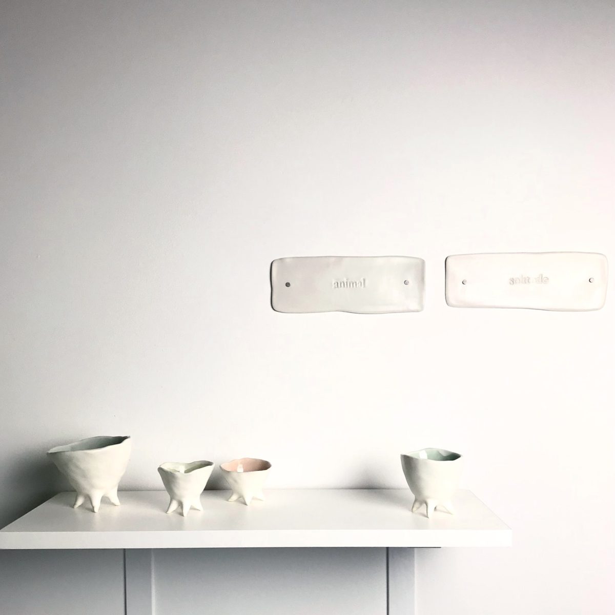
My solo sculptural installation at FARMA Part Together is a narrative journey. It is an exploration of ceramic material through hand-building and slip-casting. It is a weaving together of nature with human form, and of thoughts drifting during the making process, asking, seeking and exploring. 


The free-standing sculptures echo tree trunks where the roots sink into the ground.


The small pinched pots are like funny sprites popping up among flowers.


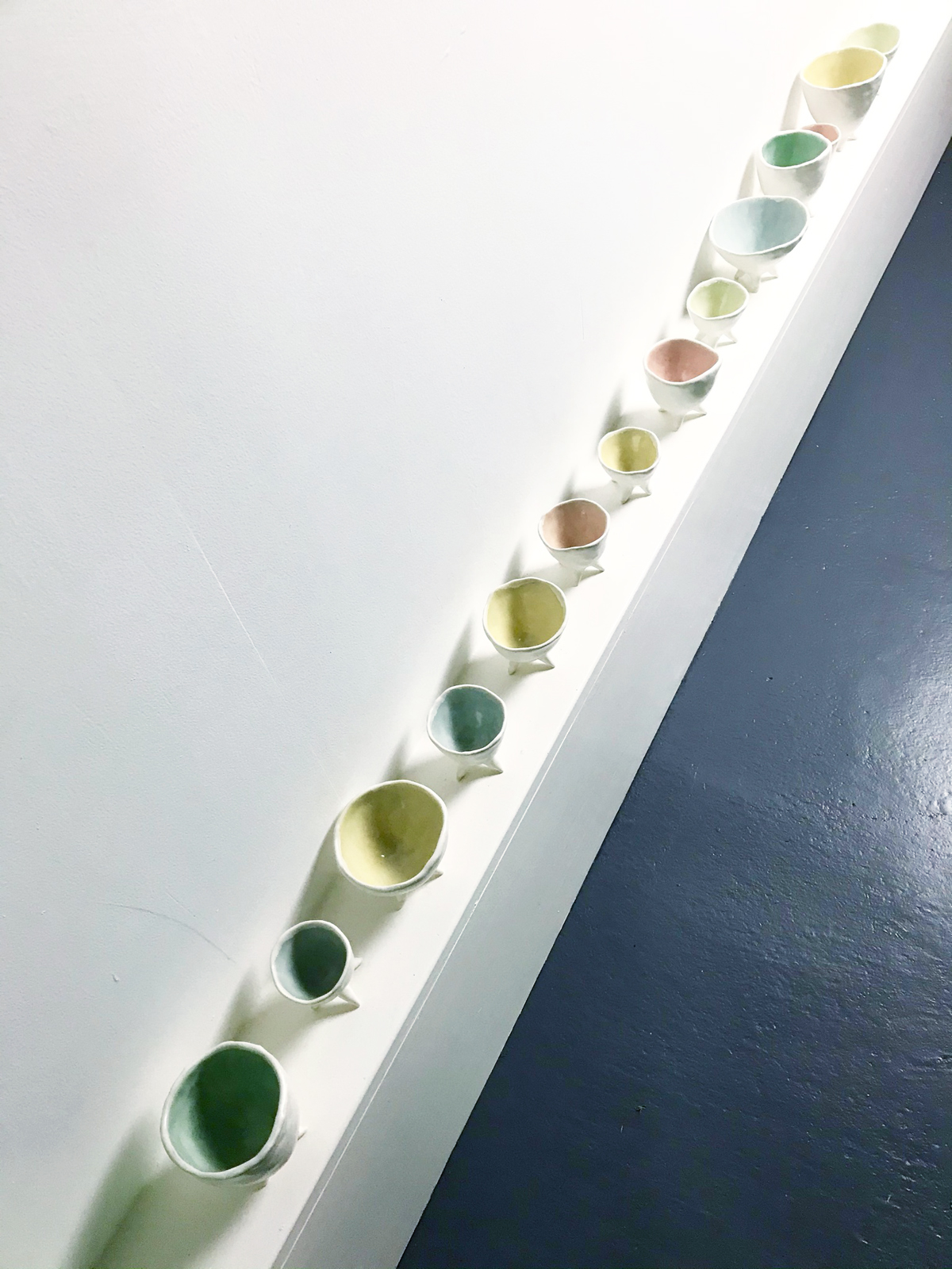
The "remnant shells" are hollowed out remains, sometimes found enveloped in vines, home to insects and other magical creatures. The wrought iron wall mounts were forged by Ken Roby in his Ohio-based studio, The Village Blacksmith.


The word tiles are thoughts that surface during the making process. 

Growing up in St. Petersburg, Russia, I was surrounded by the historically rich world of Imperial Russia. Summers were spent outside the city, at my family dachya, not far from tsars’ summer marble and stone residences. In direct contrast, our rustic dachya was built by great-grandfather Simon, with wood found on the property.   

Family legends describe Simon’s soft spoken demeanor and  the healing power of being in his presence. Great-grandpa Simon built the dachya after his return from Siberia. He served in exile after being found guilty of owning his own business. 

Surrounded by a deep pine forest, he found solace in working with his hands. Immersed in nature, it was an escape from busy city life, perhaps an escape from his Siberian experiences. His serene presence is still felt there. The meditative repetitive motion of hand-building with porcelain, connects me to experiences from the dachya. With nature as my muse, my work explores human vulnerability, fragility, unease, and resilience. 


a wedding set for K&A

A friend commissioned an everyday plates and bowls set for a wedding gift. I love the results: bowls are stamped with the couple’s initials in vintage Caslon 540 letterpress type, the wedding invitation monogram is applied to the front of the plates, the colors bring spring into K&A’s home all year round.


celebrating valentine’s day with ladyfingers letterpress

I was a fan of Ladyfingers Letterpress before I knew they were a local treasure. I loved the signage at The Mercantile Building, a new artist and business hub located in downtown Providence. I was so excited to learn that Arley and Morgan, the lovely ladies behind Ladyfingers, were the ones responsible for the exquisite hand-drawn letterforms and signs throughout The Mercantile project.
I met Morgan and Arley at a holiday sale back in November, and have been wanting to visit their studios at the Hope Artiste Village ever since. How lucky that their studios were open the day before Valentine’s Day, a gathering sponsored by the RISD Alumni office. It was a wonderful opportunity to letterpress my own valentine, and to take in all the inspiring typography on display. I walked away feeling fortunate to be a part of such a unique creative community. (click on the photos for a larger view)


letterpress treasure trove

The highlight of this weekend was visiting Letterpress Things, a letterpress refuge lovingly organized by John Barrett in Chicopee, Mass. Thank you, John, for keeping the history of the letterpress preserved and available to the public.


I kind of fell in love with a scale...
A big thank you to Molly Hatch for introducing me to this wonderful place.

daily drop cap poster by jessica hische


A stunning letter-pressed poster by Jessica Hische, featuring the daily drop cap stars. Jessica is an artist that keeps inspiring me with every one of her creations. As well as her prolific work ethic. Impressive.

gauge nyc: custom words


I am amazed by the fluidity of the words created by Gauge NYC out of simple wire. I love their idea of typography on a wall, easily installed by puncturing two small holes. Are you a poet, a writer, a lyricist? Contact Gauge through their etsy shop, and have your words transformed into sculpture.

typography by angelique


Lovely lovely typography from Angelique, an etsy shop owner. To view more of Angi’s creations, click here.

mmmm...europe...

This Cities of Europe bus scroll from TransitDesign reminds me that I have not traveled in Europe for a very long time. I’ve been to eight of these cities, I think Barcelona is next on the agenda. Soon.

on press

It’s been years since I have been “on press” to see a print job run. Back in my small design studio days, if the job was a book, for example, going on press was torturous. It entailed a lot of waiting around for the press to get up to speed, for all the dust to be removed, for the color to be balanced. It’s really an art running the offset presses, and it is fascinating to watch. Today’s press run was simple, one color, small business card, a breeze. Big thank you to Richard at Colonial Printing for making it all super easy. Here are the results:

Karen’s card is so bright, it pops out in the midst of all this machinery.

We spent a bit of time getting the color saturated (a juicy raspberry pink), and the ink coverage as even as possible on an uncoated paper stock.

I love press proofs, with all the bleed and crop and registration marks. A good way to start out the day.