hand-embroidered insect napkins, hot off the... hoop?
Nancy Ustach, mom to one of the brides registered with gleena, saw the insect platter gifted to her daughter, and was inspired to embroider napkins to match. I know nothing about embroidery, and it was fun to see the small embroidery hoop imprint around each illustration. Now I get the process...
All the embroidered insects are wonderful, but the hummingbird moth is my favorite. This simple touch adds so much personality to a traditional napkin.
Labels:
botanicals,
custom wedding gifts,
for the table,
illustration
jill vasileff at farm in wellfleet, cape cod
It takes two to tango, I took tango lessons, so I know! Tango was oh so difficult, it takes skill, and the use of muscle you don’t usually use. And it takes talent, which I didn’t have, for tango. I digress, the reason I brought up tango is because it also takes two to create a beautiful exhibition: the artist and the curator.
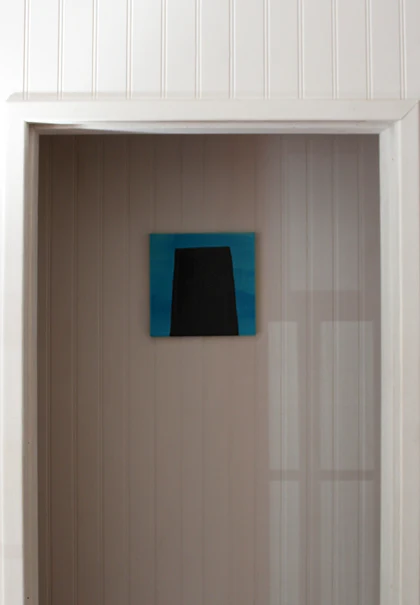
Jill Vasileff and Susie Nielsen of farm dance oh so well together. Susie embraces Jill’s work, and creates a visually stunning performance, with lots of room to take a breath. Jill’s creations are bursting with primal energy and emotion, and Susie’s expert eye has displayed them with a sophisticated sensitivity to space. Ahhh, move into color, then breathe and then get lost in the vibration... and again...
The closing reception with the artist is Saturday, June 23rd, from 6 to 8pm.
Labels:
inspiration,
recommendations
breathing in squam
The moment I pulled into the squam art workshop campground, my body relaxed with a breath filled with pine trees. This is some kind of paradise, I thought. I had been invited to participate in the squam art fair, which takes place after each workshop, in June and September. I was there for just a night, tiptoeing out with first light to head back to the studio, but it still felt like a vacation. I met incredible open-hearted people, passionate about making art a big part of their life. I felt lucky and honored to be there. Thank you.
Labels:
observations
the new decor section at gleena.com
For quite some time now I have been thinking of how to expand the gleena business. I love working with porcelain and plaster and glazes, but have to admit that what I do is extremely labor intensive. As a respite from the physicality of ceramics, I love sitting down for a few hours to write for My Mama’s Table. I enjoy featuring other artists’s work the most. The visit to Laura Kramer’s studio was such a treat, and I hope to do more studio tours in the future.
I’ve decided to bring gleena and My Mama’s Table together by trying out a new decor section on gleena.com. In this section, I now offer a few products from artists I have met and admire, whose work complements the gleena line. All the objects are uniquely handmade, all with the artist’s hand evident in the final product. The pieces I choose have soul and one of a kind personality. I love them in my own home, and want to make them available to others. Here are the artists I include:
gaugeNYC, based in Brooklyn, NY, hand-forged bronze metal letterforms:
Joe Kennedy, based in Vermont, giant bowls turned out of found wood:
LBK Studio, based in Fall River, RI, hand blown glass:
Teresa Green, based in Barrow Upon Soar, Leicestershire, England, hand printed cotton towels:
Metal, wood, glass, cloth are represented. What do you think? I would love feedback on this new venture!
Labels:
gleena
a very satisfying, and challenging, commission
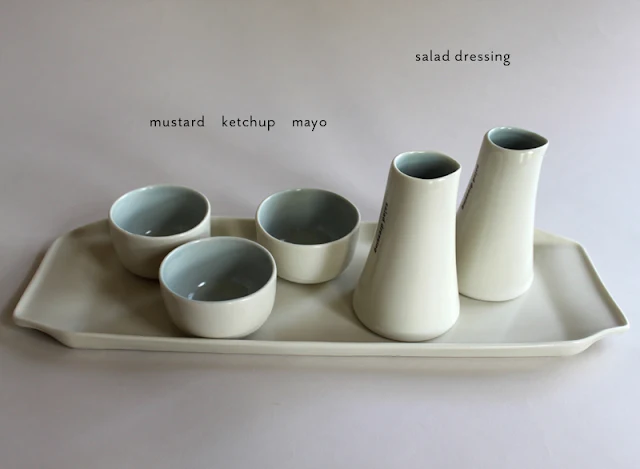
Lippincott, a graphic design firm with offices in NYC, recently renovated their space and was looking for unique tableware to compliment the new decor. I was lucky to have been chosen to create their custom set of dishes. The challenging part of the project was that certain items requested by Lippincott were not yet part of the gleena line. The lucky part was that I have been wanting to create the same pieces for a while, but have not had the time, and needed this extra push. Here are the new pieces designed for the project:
The condiments tray holds two salad dressing bottles, and bowls for ketchup, mayo, mustard, etc. Lippincott orders lunch from a few catering places which deliver sandwiches with condiments in small plastic containers. The porcelain bowls easily fit the plastic containers, hiding them in a much nicer presentation.
The labels on the side of the bottles are set in Lippincott’s corporate typeface, Stymie.
The coffee accessories tray holds a milk pitcher, a cylinder for spoons (or stir sticks), and a container for sugar/sweetener packets.
The word ”sweet“ is stamped into the bottom of the sugar packet container.
The 10-inch lunch plates are decorated with the Lippincott logo.
The 7.5-inch dessert plates are decorated with graphics provided by Lippincott. They are clever collages of the logos the company has designed over the years. My image transfer process was definitely pushed to the limit with these graphics. Solid, even coverage is impossible with a transfer from a laser printer, and it was wonderful that the client embraced all the quirks of this low-tech, handmade process. Each plate ended up being unique, creating a sculptural presentation.
The soup/salad bowls are stamped with a letter on the front, and a corresponding client’s name on the inside lip.
The staff that sets up the lunches wanted to handle the food as little as possible. A 12" in diameter salad serving bowl fits the salads delivered in a plastic container, again making for a nicer presentation, with no food handling and easier clean up.
The mugs are decorated with the home cities of the firm’s partners, making for a nice conversation starter at client meetings. Lippincott logo and motto are applied to the bottom of each mug.
The staff was a little bit concerned with the durability of my dishes, they serve lunch to a client almost every day. This will be a good test of porcelain (my own formula, mixed in the studio). I think it is extremely durable, and I hope Lippincott is amazed by its strength!
Labels:
commissions
Subscribe to:
Comments (Atom)


