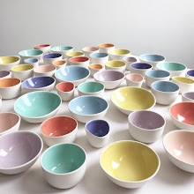
 My client chose the organic bowls set and the butterfly platter for special occasions, and the roomy cups for every day cups of tea and coffee. She wanted the pieces personalized, and decided on the couple’s names and date of their wedding on the serving pieces, and their initials on the cups.
This wonderful commission combined my two loves, graphic design and ceramics. I so enjoyed collaborating with my client, and designing the round mark for the couple. I used Mrs. Eaves typeface for the names and date. Applying it to porcelain instead of paper was very satisfying.
When the pieces fire in the kiln, part of the type and image fade by melting into the glaze and porcelain, creating a slightly antique feel. A lovely combination of old and new.


